
Cut a stencil badly and the whole print suffers. The shape might be right, the paint decent, but if the underlying grid is off – if spacing decisions were made carelessly or proportions weren’t thought through – the finished piece announces its own disorder. Anyone who has worked with physical templates for more than an hour understands this intuitively. Pattern isn’t decoration. It’s the scaffolding that holds everything else together.
That instinct for structured thinking reaches well beyond the craft room. The same core logic surfaces in interface design, editorial layout, and how digital platforms organize experience to feel natural rather than forced. Sites like sankra, which have shaped their interface around deliberate structural choices for a discerning digital audience, illustrate how design discipline converts directly into user confidence and return visits.
What Patterns Actually Do
A pattern isn’t just repetition. That’s the common misreading. Repetition is mechanical – the same element looped until a space fills. Pattern is relational. It’s about how elements relate to each other, how intervals are maintained or deliberately broken, how the eye moves through a composition without being told where to look.
Stencil makers working at a serious level know the difference immediately. You don’t just repeat a motif across a surface. You calibrate the negative space, adjust the rhythm at corners, decide when symmetry should hold and when a slight variation makes the design breathe rather than feel stamped. Those micro-decisions are where craft separates from reproduction.
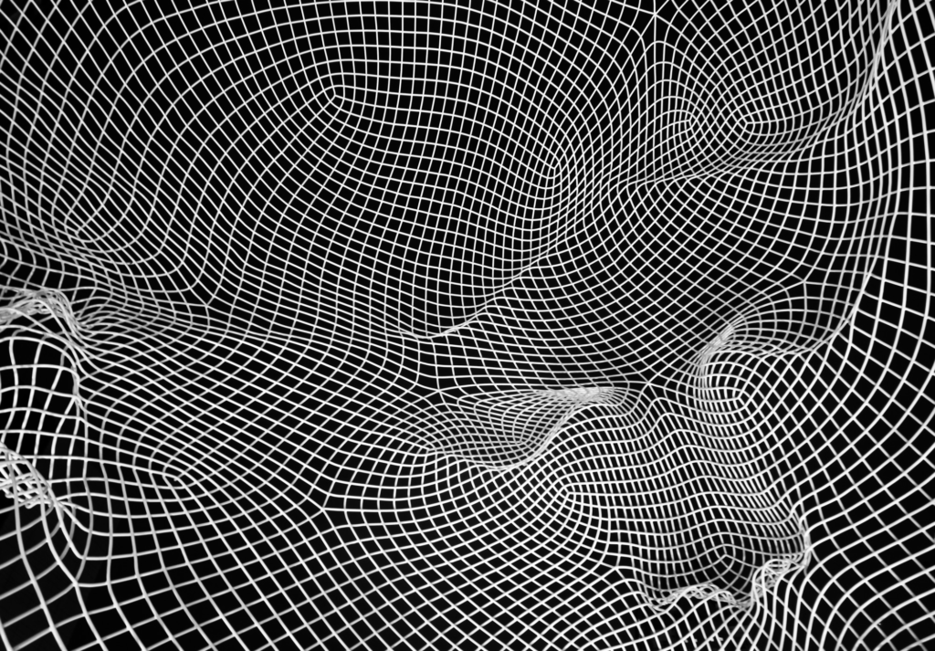
The Grid as a Thinking Tool
Grids predate digital design by centuries. Medieval manuscript illuminators used underlying geometric structures to govern where text sat and where decorative elements could expand. The grid, across every context, does the same thing: it converts intuition into repeatable, transferable decisions. In modern creative software, the grid is still present – sometimes visible, often hidden, always influencing. When a designer snaps an element into alignment, they’re deferring to structure that keeps composition from drifting. When a stencil is built for A4 printing, the coordinates of every edge exist within a spatial logic that makes it reproducible regardless of who prints it.
Pattern Recognition as a Cognitive Habit
The ability to perceive and apply patterns isn’t only a design skill – it’s a general cognitive habit that transfers across disciplines. People who work regularly with templates and structured visual systems develop a sharper sensitivity to structural coherence in contexts that seem unrelated. A crafter analyzing why a border stencil works – why a particular repeat feels satisfying at one scale and crowded at another – is exercising the same faculty a UX designer uses when evaluating why a navigation structure feels intuitive or disorienting. Domain differs. Underlying thinking doesn’t.
Where Creative and Digital Pattern Thinking Converge
| Context | Pattern Element | What It Governs |
| Stencil design | Repeat unit + negative space | Visual rhythm, printability, scale |
| Editorial layout | Column grid + baseline grid | Readability, hierarchy, flow |
| UI/UX design | Component spacing + alignment | User orientation, cognitive load |
| Digital platform UX | Information architecture + visual weight | Trust, engagement, navigation |
| Textile/surface pattern | Motif repeat + colorway | Aesthetic coherence, production |
These disciplines share actual structural DNA. The person who understands why a floral repeat works at a 15-centimeter tile and fails at 8 centimeters has grasped something real about scale and visual density – concepts that apply identically when a team debates whether a dashboard widget should span two columns or three.
Learning to See the Structure First
Most beginners in any visual discipline start with outcomes. They want the finished stencil, the finished interface. The structure that makes outcomes possible stays invisible until something breaks – until a print smears at the edge because cutout bridges were too thin, or a repeat doesn’t tile because anchor points weren’t set. Experienced practitioners reverse that. They start with structure: what is the base unit, what is the interval, where are the fixed points everything else organizes around. Once those decisions are made deliberately, the rest has an internal logic that makes problem-solving faster.
Why Templates Teach Better Than Freehand Work
Art educators use templates and grids with students before encouraging pure freehand exploration for a reason. Constraints reveal principles. Working within a stencil forces you to understand the relationship between edge, form, and space in ways that open-ended mark-making never requires. The limitation is the lesson. The same argument holds for digital design systems. Working within a strict component library forces designers to internalize spatial relationships that freeform tools let you ignore entirely. The discipline of the constraint builds pattern literacy that persists long after the constraints are lifted.
The Satisfaction of a Coherent System
There’s a specific satisfaction that comes from working inside a well-designed pattern system – a stencil set where every piece scales cleanly, or a digital interface where each interaction belongs to the same underlying logic. That satisfaction isn’t superficially aesthetic. It’s the pleasure of encountering something genuinely thought through. Someone made decisions, tested them against each other, and built something that holds. Pattern thinking, wherever it surfaces, is about that: enough structure to make coherence possible, enough flexibility to keep the result alive.