
What Makes a Font Suitable for Stencil Printing
A good stencil font must remain clear after printing and cutting. Each letter needs strong lines, open spaces, and stable inner sections. Decorative details may look attractive on a screen, but they can create problems during cutting.
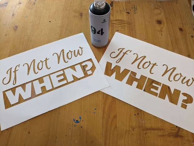
The first feature to check is the letter structure. Letters such as A, B, D, O, P, Q, and R contain enclosed spaces. These spaces form small inner shapes called counters. A standard printed letter holds these shapes in place with ink. A cut stencil needs small connections called bridges. The bridges attach each inner shape to the rest of the stencil.
A traditional stencil typeface includes these bridges in its design. For example, a stencil-style letter O often has two small gaps. These gaps keep the center of the letter connected to the paper. Without them, the center falls out after cutting.
You can also add bridges to a standard typeface. Place narrow gaps in letters with enclosed spaces before printing. Add the gaps in areas where they will cause the least visual change. A gap at the top or bottom of a letter usually looks cleaner than a gap placed in the middle.
Letter thickness also affects stencil quality. Thin strokes can tear during cutting or painting. Very thick strokes can reduce the open space inside each letter. A medium or bold weight usually gives the best balance.
Consider a classroom teacher who needs large alphabet stencils for a bulletin board. A thin script style would take a long time to cut, and the narrow lines could tear. A bold block style would produce stronger templates and clearer letters. The teacher could reuse the same stencils for several displays.
Simple letter shapes also improve cutting speed. Straight lines and smooth curves are easier to follow with scissors or a craft knife. Small curls, sharp corners, and uneven edges require more control. These details can create rough cuts, especially on small letters.
The material also changes the font requirements. Regular printer paper works for one-time projects, but it tears easily. Cardstock works better for reusable stencils. Plastic sheets can last much longer, but they require stronger cutting tools. A font with clean, wide strokes works well across all three materials.
The final use should guide your choice. A stencil for a wall sign needs strong shapes that remain visible from a distance. A stencil for a greeting card can use smaller and softer details. A stencil for a storage box needs simple letters that remain easy to read.
Before you select a typeface, ask these questions:
- Do the letters include bridges?
- Are the strokes thick enough to cut?
- Are the inner spaces large enough to remain open?
- Can you read the letters from the required distance?
- Does the style match the project?
These checks prevent common printing and cutting problems.
Serif vs. Sans Serif Fonts for Letter Stencils
Serif fonts have small lines at the ends of their main strokes. Times New Roman and Georgia are common examples. Sans serif fonts do not have these extra lines. Arial, Helvetica, and Verdana are common sans serif examples.
Sans serif fonts usually work better for printable letter stencils. Their simple shapes reduce the number of cuts. Their clean lines also improve readability. These features make them useful for signs, labels, school projects, and large wall text.
Arial Black works well for bold signs. Its thick strokes create durable stencil sections. Verdana works well at smaller sizes because it has wide letters and open inner spaces. Impact creates narrow but heavy letters, so it fits long words into limited horizontal space.
You can compare several typefaces before you prepare the final template. A large online font collection can help you review block, decorative, handwritten, and stencil-style options in one place. This step makes it easier to match the letter style with the project.
Serif fonts can still work for decorative stencils. They suit formal signs, vintage designs, wedding decorations, and traditional monograms. However, the small serif details can break or bend during cutting. They can also collect excess paint during stencil use.
For example, a person making table numbers for a formal wedding may choose a serif style because it matches the event. The person should print the numbers at a large size and use thick cardstock. The larger scale will protect the small details and make the numbers easier to cut.
A hardware store may need reusable stencils for shelf labels and storage bins. A sans serif typeface would be a better option. Employees need to read the labels quickly, and the stencil must survive repeated use. Bold sans serif letters provide clear results and strong edges.
Script fonts create a handwritten look, but they present several problems. Thin joining lines can tear. Loops can create loose inner sections. Closely connected letters can also become difficult to paint. Use a script style only for large decorative projects, and simplify the design before cutting.
Display fonts can work for themed projects. A western-style typeface may suit a party sign. A rounded typeface may suit a child’s room. A distressed typeface may suit a rustic wooden board. Each extra detail increases the cutting time, so the visual benefit should justify the added work.
The following comparison can help:
| Font type | Main advantage | Main limitation | Best use |
| Sans serif | Clear and easy to cut | Can look plain | Labels, signs, school projects |
| Serif | Formal and decorative | Small details may tear | Wedding signs, monograms |
| Script | Personal and elegant | Thin connections are fragile | Large decorative text |
| Display | Strong visual style | Detailed shapes take longer to cut | Themed signs and crafts |
| Stencil typeface | Built-in bridges | Style options may be limited | Reusable cutting templates |
A sans serif or dedicated stencil style is the safest starting point. A serif or display style can work when appearance has a higher priority than cutting speed.
Font Weight, Letter Spacing, and Print Size
Font weight describes the thickness of each letter stroke. Common weights include light, regular, medium, bold, and black. Printable stencils usually need medium, bold, or black text.
Light letters can tear after cutting. They also allow paint to spread beyond the intended edges. Bold letters create stronger stencil sections and clearer painted shapes.
However, the heaviest option is not always the best choice. Very thick letters can close small inner spaces. A lowercase e may lose its center opening. A capital R may become difficult to recognize. Print a sample before selecting the final weight.
Letter spacing controls the distance between characters. Tight spacing can cause letters to touch. Touching letters may create one large cutout instead of separate shapes. Wide spacing improves cutting access and makes each character easier to identify.
A practical spacing range depends on the letter size. Small letters may need only a few millimeters between characters. Large letters may need one centimeter or more. The cutting tool also matters. Scissors need more space than a precision knife.
Word spacing also affects readability. A narrow gap between words can make a phrase difficult to scan. Increase the gap when the stencil will be viewed from a distance.
For example, a homeowner may create a “WELCOME” stencil for a wooden porch sign. Seven-inch bold letters with moderate spacing would remain easy to cut and read. Three-inch letters with tight spacing could look crowded on the same board.
Print size affects every part of the stencil. Large letters support thicker bridges and wider openings. Small letters require simpler shapes. Decorative details that work at 12 inches may disappear at 2 inches.
Use these general size ranges as a starting point:
- 1 to 2 inches for cards, labels, and small crafts
- 3 to 5 inches for boxes, posters, and indoor signs
- 6 to 10 inches for wall art, banners, and wooden boards
- More than 10 inches for outdoor signs and large displays
The viewing distance should guide the final size. A label viewed from one foot away can use small letters. A banner viewed from across a room needs larger letters. An outdoor sign may need very large text with strong contrast.
Print one test word before printing the full template. Choose a word that includes straight lines, curves, and enclosed spaces. “BOARD,” “PARK,” or “WELCOME” can reveal several possible problems. Check the bridges, stroke thickness, spacing, and overall readability.
Place the test page on the intended surface. View it from the normal reading distance. A design that looks clear on a computer screen may look too small after printing.
You should also check printer settings. Select the actual-size or 100-percent scale option when the exact dimensions matter. Avoid automatic fit settings because they can reduce the letters. Use landscape orientation for wide words and portrait orientation for narrow designs.
Multi-page printing can support very large stencils. Print one section of the design on each page. Align the page edges with registration marks, and tape the pages together before cutting. Keep each letter away from page seams where possible.
Choosing Fonts for Cutting by Hand or Machine
The cutting method should influence the final typeface choice. Hand cutting requires simple shapes and enough space for the tool. Machine cutting can handle smaller details, but the design still needs stable connections.
Scissors work best with large block letters. They handle straight lines and broad curves well. They struggle with tight inner corners and small enclosed spaces. Use scissors for basic school projects, posters, and one-time paper stencils.
A craft knife gives more control. It can cut inner sections without folding the paper. It works well with medium-size letters and moderate detail. Always place a cutting mat under the stencil, and move the material instead of twisting the knife.
Consider a parent preparing name stencils for a child’s bedroom wall. Large sans serif letters would allow fast hand cutting. The parent could print each letter on cardstock, cut the shapes with a knife, and attach the finished templates to the wall with low-tack tape.
Electronic cutting machines can process detailed designs from digital files. Common machines can cut paper, vinyl, cardstock, and thin plastic. They can also repeat the same stencil with consistent results.
Machine cutting allows more typeface options, but it does not remove every limit. Very thin lines can lift from the cutting mat. Small bridges can break during removal. Closely spaced details can merge. The blade type, material, pressure, and speed all affect the result.
A small business may use a cutting machine to create packaging stencils. The owner may apply a logo and product number to kraft boxes. A bold geometric typeface will cut faster and produce consistent marks. A detailed script style may slow production and create more material waste.
Check the file format before machine cutting. Many machines accept SVG files because this format stores clean vector paths. PNG and JPG files use pixels, so the software may need to trace their edges. Poor tracing can create rough lines and extra cutting points.
Convert text to outlines before sending the design to another device. This step preserves the exact letter shapes, even when the other computer does not have the same typeface installed.
Test the design on inexpensive material first. Cut one word or several sample letters. Include A, B, O, R, and S because these characters reveal common problems with bridges and curves.
Inspect the test cut for four issues:
- Thin areas that tear during removal
- Inner sections that fall out
- Corners that lift from the material
- Letters that lose clarity after cutting
Adjust the weight, size, spacing, or bridge width if you find any of these problems.
The best stencil typeface supports both the design and the production method. Simple bold letters suit most hand-cut projects. Clean vector shapes suit machine cutting. Large decorative letters can work when the material and tools can support the added detail.
A short test can prevent wasted paper, vinyl, paint, and time. Print or cut a sample, check each letter, and make small changes before producing the full stencil.